These projects bring together all the pieces of a campaign; from event branding and signage to digital and print touchpoints, to create one connected experience. It’s about making everything feel cohesive, whether it’s online, in print, or in person.
⚡️ Spark Something Bigger! A campaign for United Way of Central Maryland in collaboration with Vybe Well Media. In an effort to Spark website traffic and donations, this campaign launched media on all platforms to reach a larger audience.
I worked on pieces that included animation, commercials, email blasts, social, Google Ads, and direct mail pieces to get the word out. I’m happy to say it truly made an impact and the campaign ran for an entire additional quarter based on its success. ⚡️
A month-long celebration of comedy includes acts at multiple venues across the Glass City. Logo for the brand and multiple applications include animation, social media posts, apparel, and website use.
Holy Toledo that's funny!
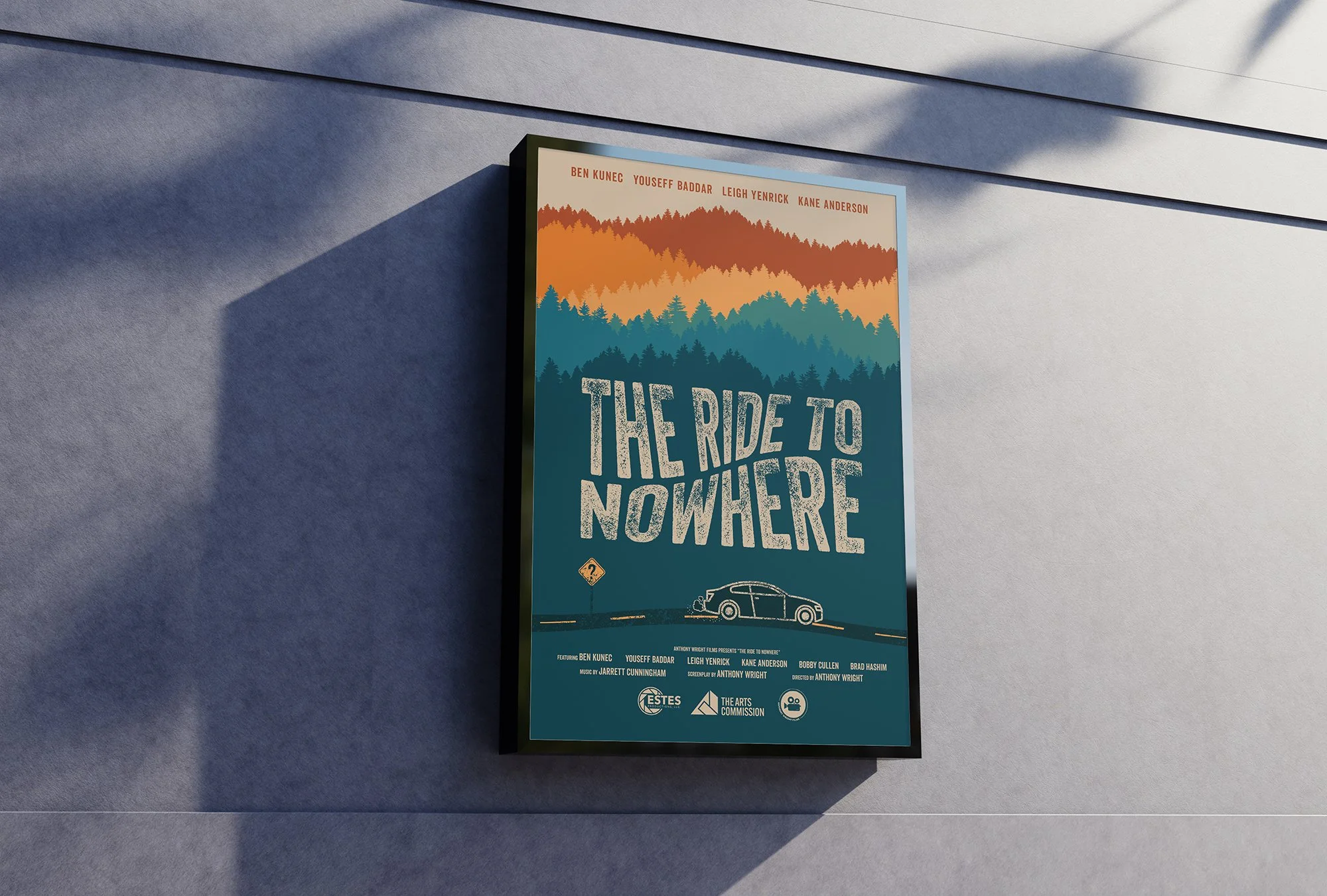
Various print projects from paper to apparel.
Great Black Swamp Brewing Company was established in Toledo, Ohio in 2009. They’ve opened a new location including a brewery, tavern, and beer garden all-in-one. Along with this new construction, I was tasked with refreshing their brand. With a reimagined logo set, icons, cans, website, and more, Great Black Swamp Brewing Company will roll out a new look on all facets of their business.
After Effects animations for clients and experiments alike.