Great Black Swamp Brewing Company was established in Toledo, Ohio in 2009. They’ve opened a new location including a brewery, tavern, and beer garden all-in-one. Along with this new construction, I was tasked with refreshing their brand. With a reimagined logo set, icons, cans, website, and more, Great Black Swamp Brewing Company will roll out a new look on all facets of their business.
⚡️ Spark Something Bigger! A campaign for United Way of Central Maryland in collaboration with Vybe Well Media. In an effort to Spark website traffic and donations, this campaign launched media on all platforms to reach a larger audience.
I worked on pieces that included animation, commercials, email blasts, social, Google Ads, and direct mail pieces to get the word out. I’m happy to say it truly made an impact and the campaign ran for an entire additional quarter based on its success. ⚡️
While working with the Toledo Mud Hens MiLB baseball club, I had the opportunity to design a specialty jersey. During four games around Independence Day, the Hens sported jerseys inspired by the 1992 Dream Team USA men's basketball team.
Honoring the 25th anniversary of the Dream Team resulted in many design avenues with a Mud Hens twist. I'd like to share my process and the end products that stemmed from the project.
Over the course of four games, specialty jerseys were auctioned off and raised thousands for a local Alzheimer's organization. In-game photo credit: Rob Lorenzo.
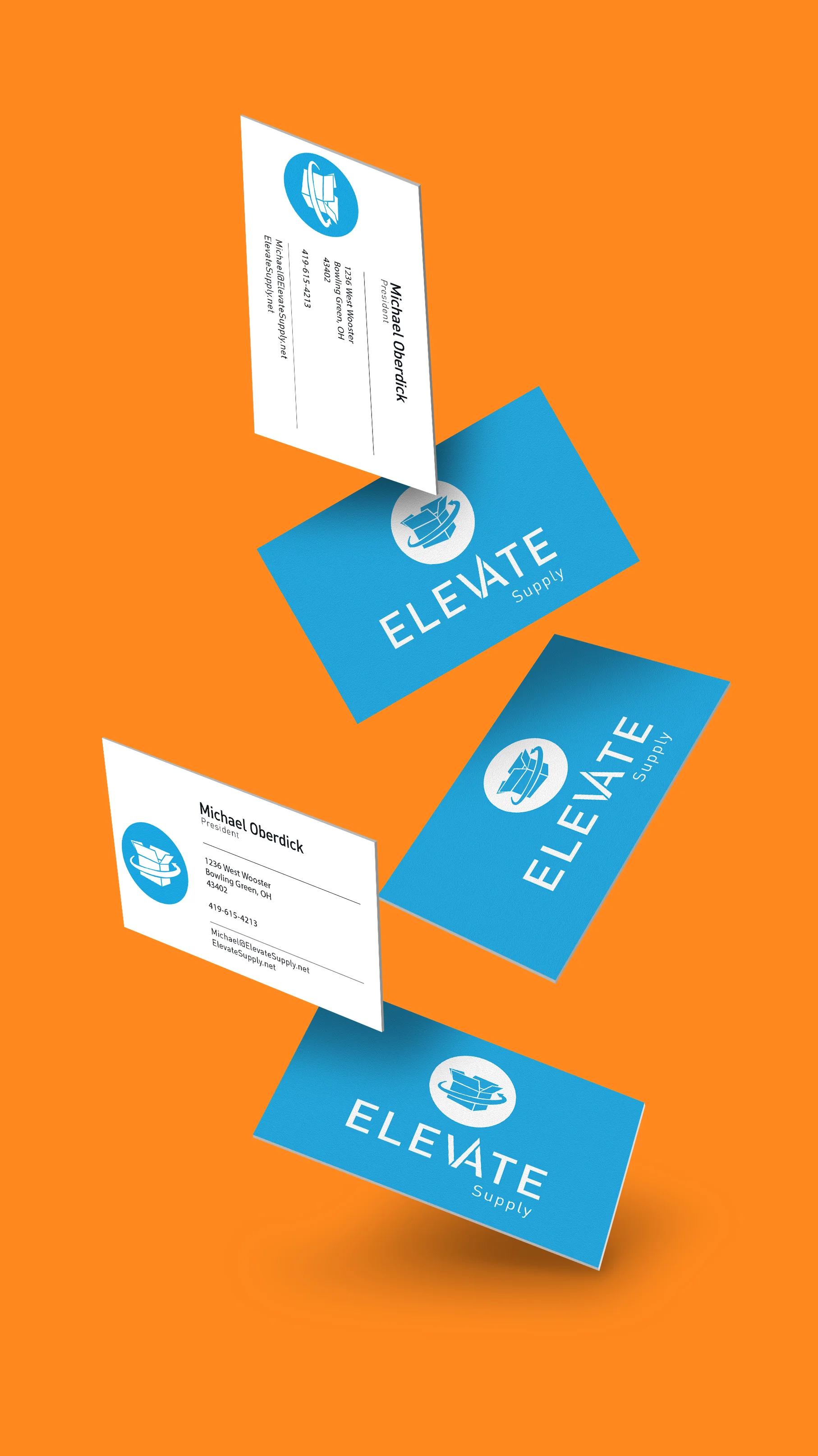
Various print projects from paper to apparel.
A month-long celebration of comedy includes acts at multiple venues across the Glass City. Logo for the brand and multiple applications include animation, social media posts, apparel, and website use.
Holy Toledo that's funny!
Morse code is one of many forms of communication that transcends typical spoken language. The code was used traditionally on railways and trains for communication. In a series of experiments, a typeface was created using dots and dashes as formal elements. Rules were set and followed for the creation of the alphabet. For example, all elements would be shown with strokes between the pieces to reveal their native form while being grouped together to create letterforms.
Words were created with the letters from the typeface and paired with photos of train cars and rail yards taken by myself and local photographers. Adding texture with line and dot halftone patterns spoke further to the dots and dashes found in morse code. It also spoke to the black and white zine application these photos were a part of because halftones are often utilized in one color prints. A black and white quick and dirty zine was the result of these experiments with the type and photo mashup.
*This piece is a winner in the Society of Typographic Arts STA 100 Type Competition, 2016. Entries judged by Neville Brody, Martin Venezky and Denise Gonzales Crisp. See the winners' gallery here.
After Effects animations for clients and experiments alike.